iBooks as a sales tool
Since April (2014), I have been creating interactive Customer Stories or Customer Journeys for Salesforce Marketing Cloud (formerly ExactTarget). These Customer Stories have pushed me, and now my team, to dive deep into using iBooks Author, along with Keynote, Photoshop and Illustrator, Google spreadsheets and lots and lots of sketching and experimenting
Its been, at times, frustrating, yet, also exhilarating. iBooks Author is still a very new (at times, buggy) software. Over the months, we have matured our process, increased our knowledge and elevated our end products.
One of our goals is to surprise people with our work and how we breath life into these stories. Sometimes we do unexpected things with the software. At one point a director commented that "You are the type of person that makes software do what you want rather than do what you are supposed to do with it." And she is right. I'm they guy who filed my taxes with Photoshop last year (kidding).
A lot of our work I won't/can't talk about, call it private/trade secret, but some, I want to talk about openly, with the hope that the intimate community of iBook Author users will benefit and perhaps share their discoveries and war stories.
In this part of the series I want to talk about the following.
- Tips, Tricks and Bugs
- Building Your Own Template
- "Responsive" content
Don’t duplicate your .iBA file
Trust me, iBooks Author is not the place to use Duplicate. Sadly its in the UI controls and you would think safe to use. However if you do duplicate your iBA file and then try and load both books only one will work. We had several big deals for Fortune 500 clients going at once and the team in the field had to keep loading one Customer Story at a time. After digging and digging I found the solution was to Save as Template and then create a duplicate version from a new template. Its a hassle, but worth it.
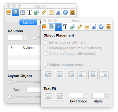
Option click on the Inspector tabs to open multiple Inspector windows.
Sometimes you need several Inspector windows open and clicking on the Icon covered Tabs at the top over and over is infuriating. Option click to the rescue!
Height and Width are not always1024 x 768
The height of your viewable space is 20px or 40px shorter than expected due to the status bar at the top of the screen. Use 1024 X 748 in your Photoshop or Keynote files to get your pixels lined up… not immediately obvious as I was doing prework in Keynote, Illustrator and Photoshop. (I am not to a point where I can “think” in iBooks Author yet.
The Colors Inspector window is expandable!
There is a tiny dot at the bottom of the window. Click and drag to expand your color palette.
"Responsive" content
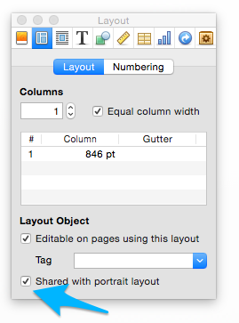
No, its not exactly responsive (like responsive web), but iBooks Author lets you customize your layouts for landscape and portrait. When you are setting up the a master (I think this is what these template are/should be called) you can designate what content is shared between the layouts. Unfortunately, you can not share the interactive widgets (these great tools are limited to just the landscape view. However, copy, shapes, and images are all sharable. Just click on the check box (Shared with portrait layout). Its in the Layout tab of your Inspector under Layout Object. This is also where you would decide if an object is editable or locked.


